If you’re familiar with T accounts (debits and credits) or diagrams showing changes to balance sheets, and you’d like to know if there’s a more intuitive way of representing them, perhaps with some sort of coloured arrow notation, you’ve come to the right place! You may even discover something new and eye-opening about the nature of economics if you’re not yet familiar with what I call the One Lesson.
There seem to be two main groups of economists who use T accounts or balance sheets:
The Post-Keynesians (e.g. Steve Keen, Marc Lavoie), and
The “Money View” economists led by Perry Mehrling.
Since I’ve studied the Money View in more depth, I’ll use a couple of its examples to illustrate the benefits of the One Lesson’s arrow diagrams.
Money View examples
Perry Mehrling does a superb job of explaining exactly how banking and money markets work by showing how the actions of participants affect each party’s balance sheet. Rather than showing T accounts with debits and credits, he draws a balance sheet (assets on the left, liabilities on the right), and shows entries being added or removed by prefixing them with a plus (‘+’) or minus (‘−’) respectively.
Civil War finance
One of his first examples from his Economics of Money and Banking course shows how, during the US Civil War1, the Union government obtained finance by issuing bonds. Mehrling showed balance sheets for:
Government
Private sector (excluding banks)
Banking system
Here’s his diagram:
This shows exactly what happens. The government issues new bonds (a debt, sometimes with a small collection of extra debts to be paid at regular intervals), and receives bank deposits (for spending on war goods). The private sector is paying with some of its bank deposits, and acquiring the bonds. And the banking sector makes the deposit transfer happen by debiting the deposit account of the private sector (decreasing the bank’s liabilities), and crediting the deposit account of the government (increasing the bank’s liabilities).
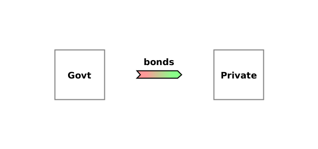
The problem with this sort of presentation is that it isn’t easy to visualise what’s actually happening, and to see that pairs of changes are in fact simply the same action seen from different people’s perspectives. For example, the ‘+bonds’ in government liabilities and ‘+bonds’ in private assets are a single action: the government creating a new debt owed to the private sector. So we can represent this pair of balance sheet changes using a single arrow, like this:
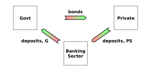
The action causes the government’s raw net worth2 to decrease (it gains a liability), and the private sector’s RNW to increase (it gains an asset), so the arrow points from the government to the private sector. Because it’s the liabilities of the government which change, its end of the arrow is pink. And because it’s the debt assets of the private sector which change, its end of the arrow is green.
There are two other actions. In one, the private sector writes off a debt owed to it by the banking system, and in the other, the banking system creates a new debt owed to the government. The resulting diagram shows how this amounts to a circular transfer: government → private sector → banking system → government.
Compare this carefully to the balance sheets above to make sure you see how each arrow corresponds to two balance sheet entries—one for each end of the arrow. (The labels on the arrows correspond to the balance sheet entries).
Eurodollar market
In his lecture on Eurodollars, Mehrling shows how a non-US bank (in this case the French bank Crédit Lyonnais) might obtain dollar “reserves” to use as a foundation for lending dollars in the Eurodollar market3:
Exxon, a large US corporation, transfers a deposit from Chase Bank in New York (Chase NY) to its account in Crédit Lyonnais in France.
Assuming Crédit Lyonnais banks with Citibank in New York (Citi NY), Chase NY transfers some of its reserves at the New York Federal Reserve Bank (NY Fed) to Citi NY.
Citi NY creates a deposit for Crédit Lyonnais.
Here are the balance sheets that Mehrling uses to show this scenario:
Compare these balance sheet changes to the 3 stages above. If it’s not clear how they relate, please leave a comment, and I’ll explain further.
(Having obtained a “reserve” of dollars in the form of a deposit at Citi NY, Crédit Lyonnais is now able to start lending dollars to customers in France by creating new dollar deposits for them. While in principle it could do this without any reserves, that would be extremely reckless because the bank would fail in its obligations the first time one of its customers requested a withdrawal or a transfer).
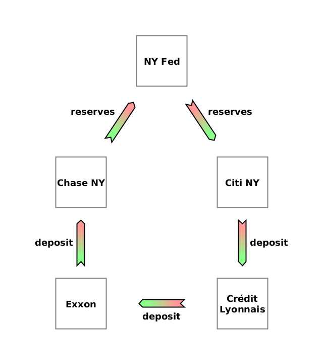
Once again, all the information needed to know what is happening is present in the balance sheets, but with it being all text, it doesn’t clearly show that there is again a circular transfer: Exxon → Chase NY → NY Fed → Citi NY → Crédit Lyonnais → Exxon. The arrow diagram makes this explicit:
These types of arrow diagram show exactly the same information as the balance sheets, but they reveal the elegant geometric structure of the scenario. They also clearly reveal the importance of RNW. At a glance, you can see for each party how much of its RNW it is giving up (the arrows pointing away from it) and how much of another party’s RNW it is receiving (the arrows pointing towards it). Learning to see the economy as transfers of RNW is what the One Lesson is all about, and it’s remarkably powerful.
There are 8 colours of arrow, corresponding to 7 types of economic action, plus one for services.
I hope you find these diagrams useful as a way to illustrate and gain intuition about scenarios which otherwise have to be understood from the changes on balance sheets. It’s certainly revolutionised my understanding of economics.
Drawing arrow diagrams by hand
The coloured diagrams are nice, but are difficult to draw by hand. As an alternative, you can:
Draw a simple arrow (‘→’)
Write letters by the tip and base of the arrow to identify the colour
‘A’ for debt asset (equivalent to green)
‘L’ for liability (equivalent to pink)
‘T’ for tangible asset (equivalent to purple)
‘S’ for a service (equivalent to white)
Draw a cross (‘×’) to represent the ‘void’ symbol in production and consumption.
Since the Confederacy wanted to break away from the Union rather than control it, I believe Tom Woods is right that it’s more accurate to call it the War Between the States.
Someone’s raw net worth (RNW) is what they own plus what they’re owed minus what they owe.
Even though it sounds like it might be complicated, Mehrling’s explanation using balance sheets makes it simple. It’s just lending of dollars by foreign banks which don’t have accounts at the Federal Reserve (the US central banking system). The foreign bank uses a deposit at a US bank as their “reserves”.


![[BS - Govt] (A) +deposits, G; (L) +bonds. [BS - private] (A) -deposits, PS; +bonds. [BS - Banking Sector] (L) -deposits, PS; +deposits, G. [BS - Govt] (A) +deposits, G; (L) +bonds. [BS - private] (A) -deposits, PS; +bonds. [BS - Banking Sector] (L) -deposits, PS; +deposits, G.](https://substackcdn.com/image/fetch/w_1456,c_limit,f_auto,q_auto:good,fl_progressive:steep/https%3A%2F%2Fsubstack-post-media.s3.amazonaws.com%2Fpublic%2Fimages%2Fbf210efd-1e8a-4903-bb29-382cf0045abd_1280x300.png)


![[BS - Exxon] (A) -deposit, Chase NY; +deposit, Crédit Lyonnais. [BS - Chase NY] (A) -reserves, NY Fed; (L) -deposit, Exxon. [BS - Citi NY] (A) +deposit, NY Fed; (L) +deposit, Crédit Lyonnais. [BS - Crédit Lyonnais] (A) +deposit, Citi NY; (L) +deposit, Exxon. [BS - Exxon] (A) -deposit, Chase NY; +deposit, Crédit Lyonnais. [BS - Chase NY] (A) -reserves, NY Fed; (L) -deposit, Exxon. [BS - Citi NY] (A) +deposit, NY Fed; (L) +deposit, Crédit Lyonnais. [BS - Crédit Lyonnais] (A) +deposit, Citi NY; (L) +deposit, Exxon.](https://substackcdn.com/image/fetch/w_1456,c_limit,f_auto,q_auto:good,fl_progressive:steep/https%3A%2F%2Fsubstack-post-media.s3.amazonaws.com%2Fpublic%2Fimages%2Fb884c988-aebd-4c5f-9057-9a91ad26716f_1280x400.png)
